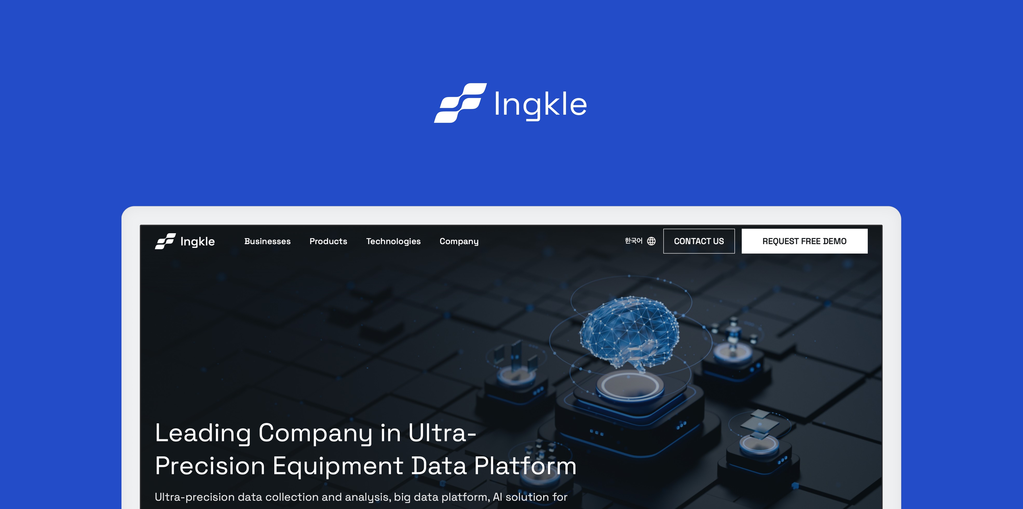
Ingkle
Redesign a website to enhance customer retention and revenue
Project Overview
I worked at Ingkle, an industrial IoT company specializing in solutions for manufacturing and environmental sectors worldwide, as a Product Designer. I led the redesign of the company website to reflect recent updates, enhance credibility, and support global expansion. The primary goal was to create a user-centric experience tailored to the needs of target users, including IT representatives of manufacturers, PLC engineers, sales agents in manufacturing and facilities, and business development officers seeking partnerships. Collaborating closely with stakeholders, I ensured the design aligned with the company’s evolving identity and global objectives, successfully delivering a polished website redesign.
My Roles
Reconstructed the information architecture to enhance navigation clarity and content organization.
Designed intuitive user interfaces, progressing from low-fidelity wireframes to high-fidelity prototypes.
Outcome & Impact
20%
increase in conversion rate
30%
increase in return visitor rate
16
Screens
Info
Client
INGKLE inc.
Timeline
April 2023 - June 2023
Team
2 Product Designers (including me)
1 Project Manager
Contribution
Information Architecture
Design System
UI Design
Prototyping
Wireframing
Goal
What is client want to solve?
The goal of the website is for people to learn about the company and either leave their contact information or request a demo. The clients wanted to redesign the website to maximize sales lead generation efficiency.
01
Update product information
Since 2022, the company has not updated its information. The client wants to provide potential customers with up-to-date information on products, technologies, and company details.
02
Refine the information architecture
The aim is to make the website easier to navigate and ensure a user-centric design, allowing users to find the information they need effortlessly.
03
Improve Key Performance Indicators (KPIs)
Average session duration: 1 min 39 sec → 5 min
Return visitor rate: 16.1% → 30%
Page views per session: 2.54 → 5
Observe the Problem
Issues Found in the Current Website
I began by visiting the website to identify existing problems. I took screenshots of the entire website to document the main issues related to information architecture and design layout.
01
No Design Patterns or Guidelines
Every product page has a different design layout, resulting in an unorganized and inconsistent user experience.
The lack of standardized design patterns and guidelines creates confusion and reduces the overall credibility of the website.
02
Unclear, disorganized, missing contents
There are missing contents labeled as “coming soon,” which looks unprofessional and leaves users without important information.
The existing content is unclear and disorganized, making it difficult for users to find what they need.
03
Lack of Clear and Visible Call-to-Action
The main goal of the website is to encourage users to take action, but the call-to-action button only appears on one page, making it easy to miss.

Ideation
Reconstruct the Information Architecture
After observing the current website and considering the client's requirements, we reconstructed the information architecture to enhance usability and ensure all necessary information is included.

▲ Information Architecture
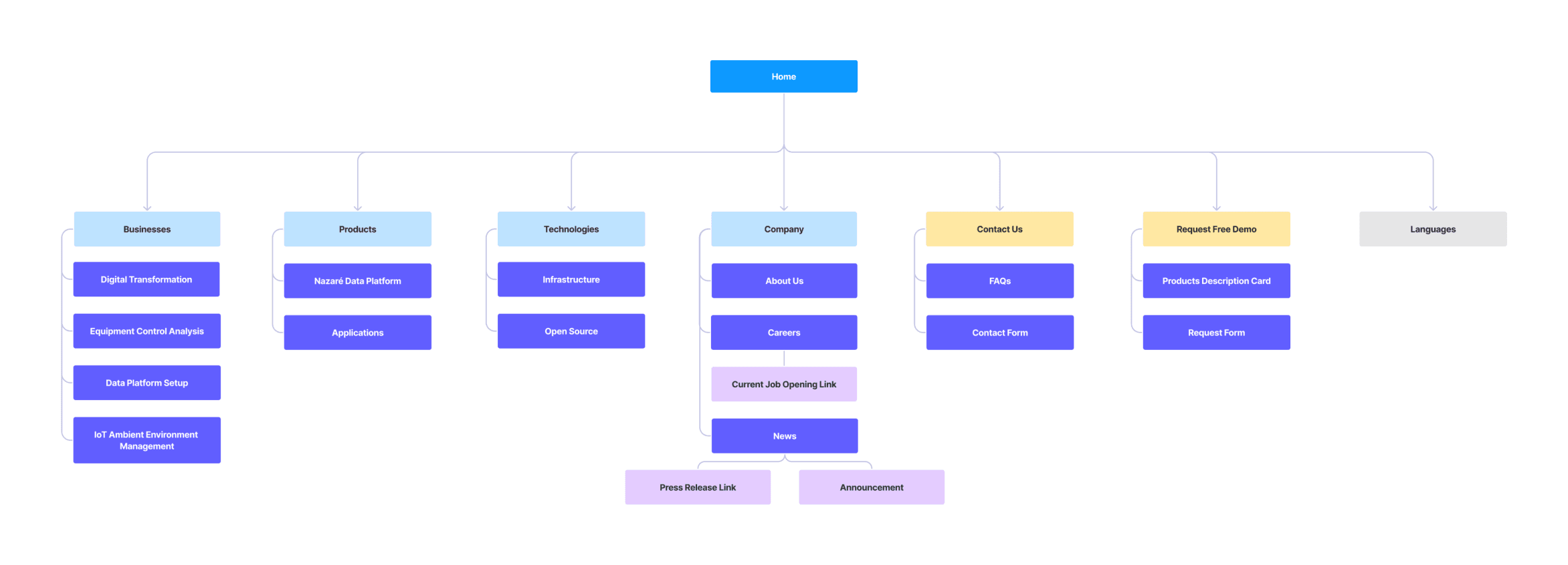
▲ Sitemap
Design
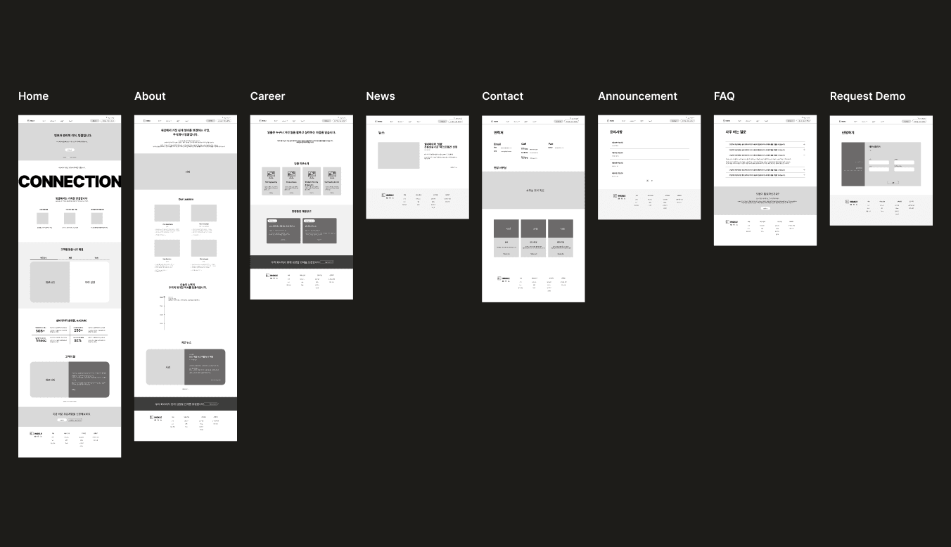
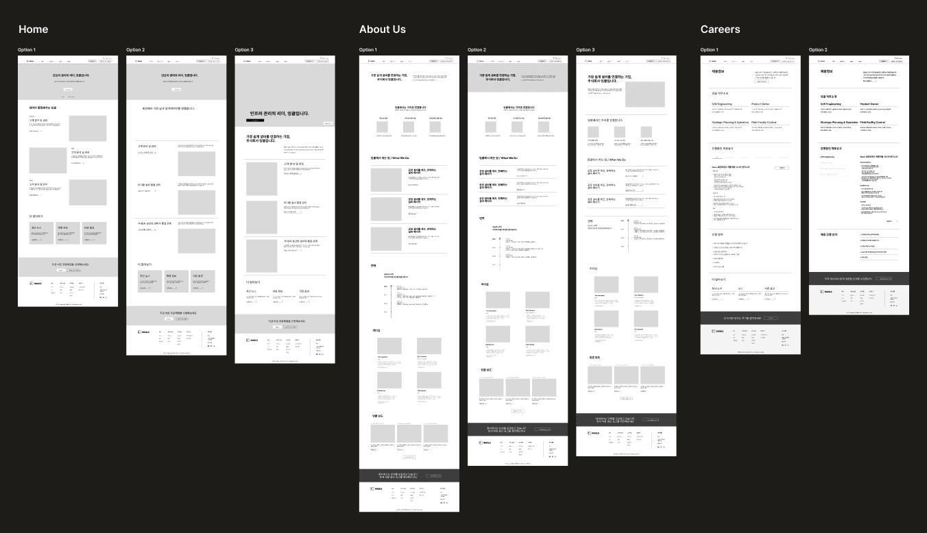
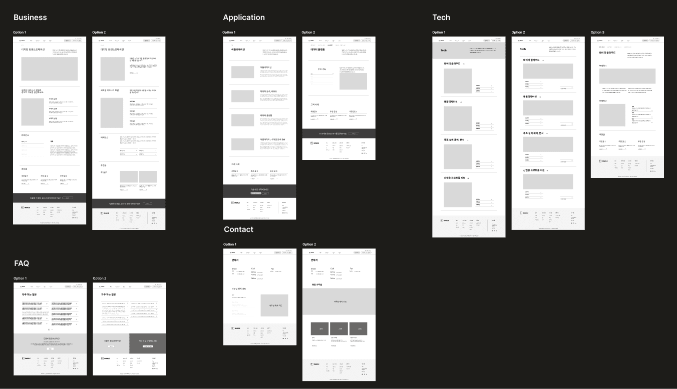
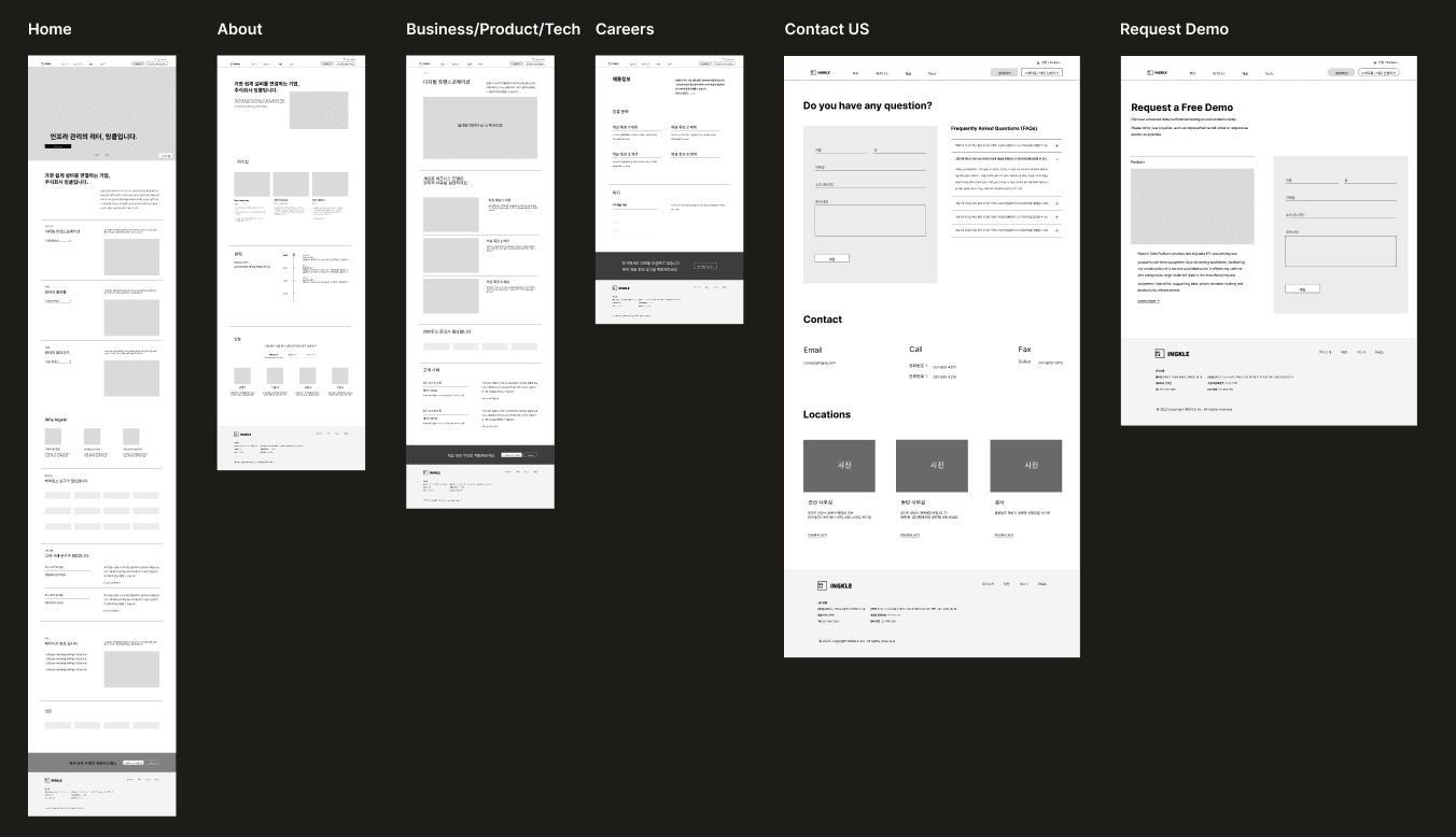
Low fidelity sketches & Iterations
After finalizing the information architecture, we designed low-fidelity wireframes to quickly test and validate ideas, user flows, and basic features. The main goal of these low-fidelity wireframes is to convey basic ideas and receive feedback from stakeholders and users, allowing us to iterate and improve the design before creating more sophisticated and detailed versions.

Branding
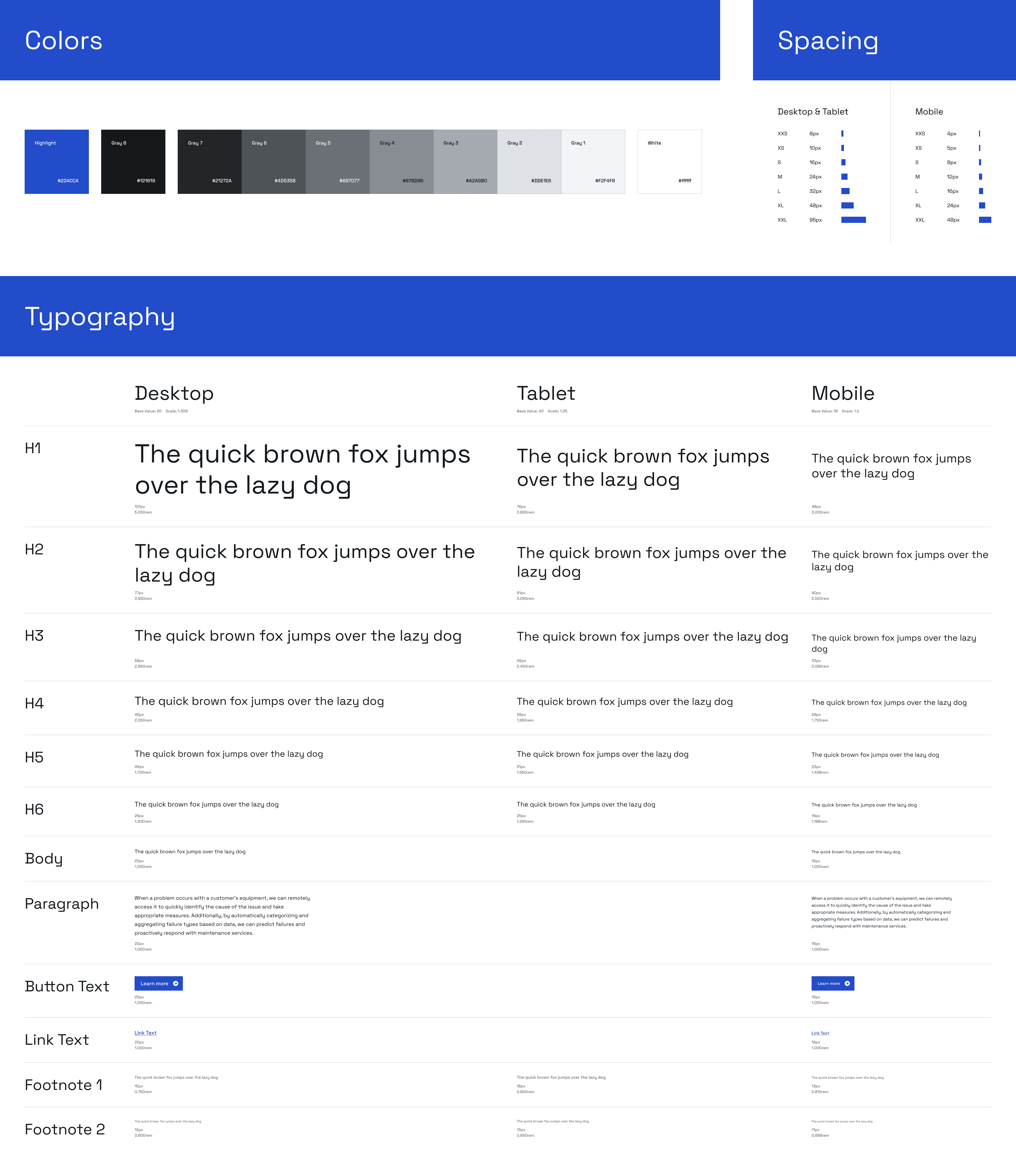
Building a Design Principle
To support the design direction, we created a brand guideline.
01
High-Tech Minimalism
We applied a futuristic and simple design to reflect the image of a high-tech company. By using minimalistic elements, we create an innovative atmosphere and prioritize functionality.
02
Refined Color Palette and Icons
To emphasize a sophisticated image, we use a restrained color scheme and enhance information delivery through icons. Icons are selected to fit their function and purpose, and they are used consistently to ensure harmonious design.
03
Readability-Focused Typography
We ensure high readability by considering font, size, and line spacing. A clean and uncluttered layout helps users understand the content, focusing on delivering the core messages of the website.
Style Guide
End Result
Final Web Design
This is the final screens for the website.
Home
When the user hovers over the navigation bar, subcategories under each main category appear, enhancing the user's ability to quickly access all available options. This design choice improves navigation efficiency and ensures a smoother, more intuitive browsing experience.
Each category item is showcased in a slideshow that automatically transitions every few seconds, giving users a quick understanding of each item and the opportunity to explore further through the "Learn more" button. This design ensures users can efficiently overview available options.
The companies' logos scroll in a single line, allowing for quick viewing in a small space. This design reduces screen length, providing a more compact and efficient display.
Under the company name, there are items that the company uses to advertise their products, each linking to a detailed page.
At the end, an additional call-to-action (CTA) encourages users to complete the final user flow.
Businesses ( Same layout with Products & Technologies)
Multiple Contact Us CTAs are strategically placed throughout to continuously encourage users to get in touch.
Summarize the features into three points to enhance readability.
Related items from other categories are included under the detailed information to encourage users to explore more of the company's offerings.
Contact Us
On the left side of the contact form, there are FAQs so users can easily view common questions and potentially find the answers they need before reaching out. It saves users time by providing quick access to information, reducing the need to wait for a response.
Similar to the Contact Us section, we added a section on the left that showcases the company's items, allowing users to see and be reminded of the products. This encourages engagement by keeping products top of mind, enhancing the likelihood of conversion.
Request Free Demo
About Us
Careers
News
Thank you for visiting my portfolio
© 2024. Designed by Sooin