Ingkle
Redesign a website to enhance customer retention and revenue
Project Overview
I worked at Ingkle, an industrial IoT company specializing in solutions for manufacturing and environmental sectors worldwide, as a Product Designer. I led the redesign of the company website to reflect recent updates, enhance credibility, and support global expansion. The primary goal was to create a user-centric experience tailored to the needs of target users, including IT representatives of manufacturers, PLC engineers, sales agents in manufacturing and facilities, and business development officers seeking partnerships. Collaborating closely with stakeholders, I ensured the design aligned with the company’s evolving identity and global objectives, successfully delivering a polished website redesign.
Info
Company
INGKLE inc.
Timeline
April 2023 - June 2023
Team
2 Product Designers (including me)
1 Project Manager
Skills
Information Architecture
Design System
UI Design
Prototyping
Wireframing
I led the redesign of the company website, resulting in an increase in conversion rate and return visitor rate.
My Roles
Reconstructed the information architecture to enhance navigation clarity and content organization.
Designed intuitive user interfaces, progressing from low-fidelity wireframes to high-fidelity prototypes.
Outcomes & Impacts
Improved Key Performance Indicators (KPIs):
Average session duration: 1 min 39 sec → 5 min (↑ 203% increase)
Return visitor rate: 16.1% → 30% (↑ 86.3% increase)
Page views per session: 2.54 → 5 pages (↑ 96.9% increase)
Project Goal & Scope
Redesign the website to boost sales leads & improve user experience


Goal 1
Increase user engagement in requesting free demo & contact
What did we find out?

Lack of CTA Buttons Reduces User Engagement and Page Exploration
The primary goal of the website is to encourage potential customers to contact the company for more information about the product or request a demo. However, we discovered that the website has only two CTA buttons, making them difficult to find. As a result, users may struggle to take action and are less likely to explore additional pages.
How did we decide to solve the problem?

Boosting Engagement Through Frequent CTA Exposure
To encourage users to take action, we believed that increasing the visibility of CTAs was essential. The simplest yet most effective approach was to display them repeatedly on a single page, ensuring users could easily identify and engage with them to complete their desired actions.
Output


Goal 2
Increase average session duration and reduce the bounce rates
What did we find out?

Limited User Engagement Opportunities
There are no interactive elements, testimonials, or compelling storytelling to keep users interested. Without engaging content, visitors are more likely to leave quickly.
Minimal Content Depth
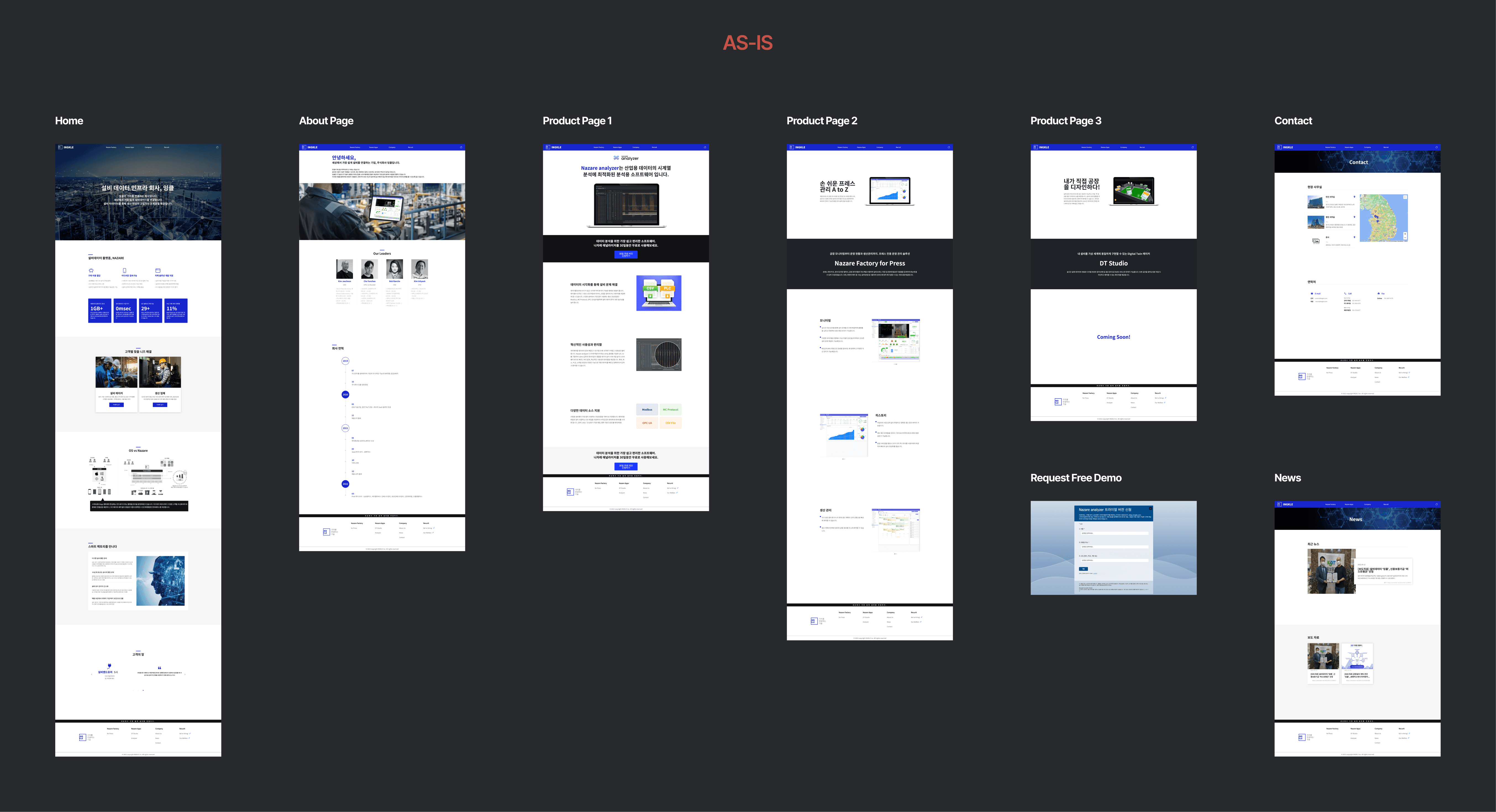
The current landing page lacks an overview of services and solutions, making it difficult for users to quickly find relevant content.
How did we decide to solve the problem?
Reconstructing the information architecture to improve clarity and simplify navigation
We started with reconstructing the information architecture and user flows to improve the clarity, usability, and engagement of the landing page. By organizing content more logically and refining navigation, we ensured that users can quickly find relevant information, reducing friction and improving conversion rates.

Output


Goal 3
Improve UI consistency
What did we find out?
The absence of standardized design patterns undermine the website’s credibility
While the website has a fixed primary color, it lacks a cohesive design principle, resulting in inconsistencies across elements. This not only confuses users but also diminishes trust in the platform, emphasizing the need for a comprehensive design system to ensure visual consistency and a more professional user experience.
Branding
Building a Design Principle
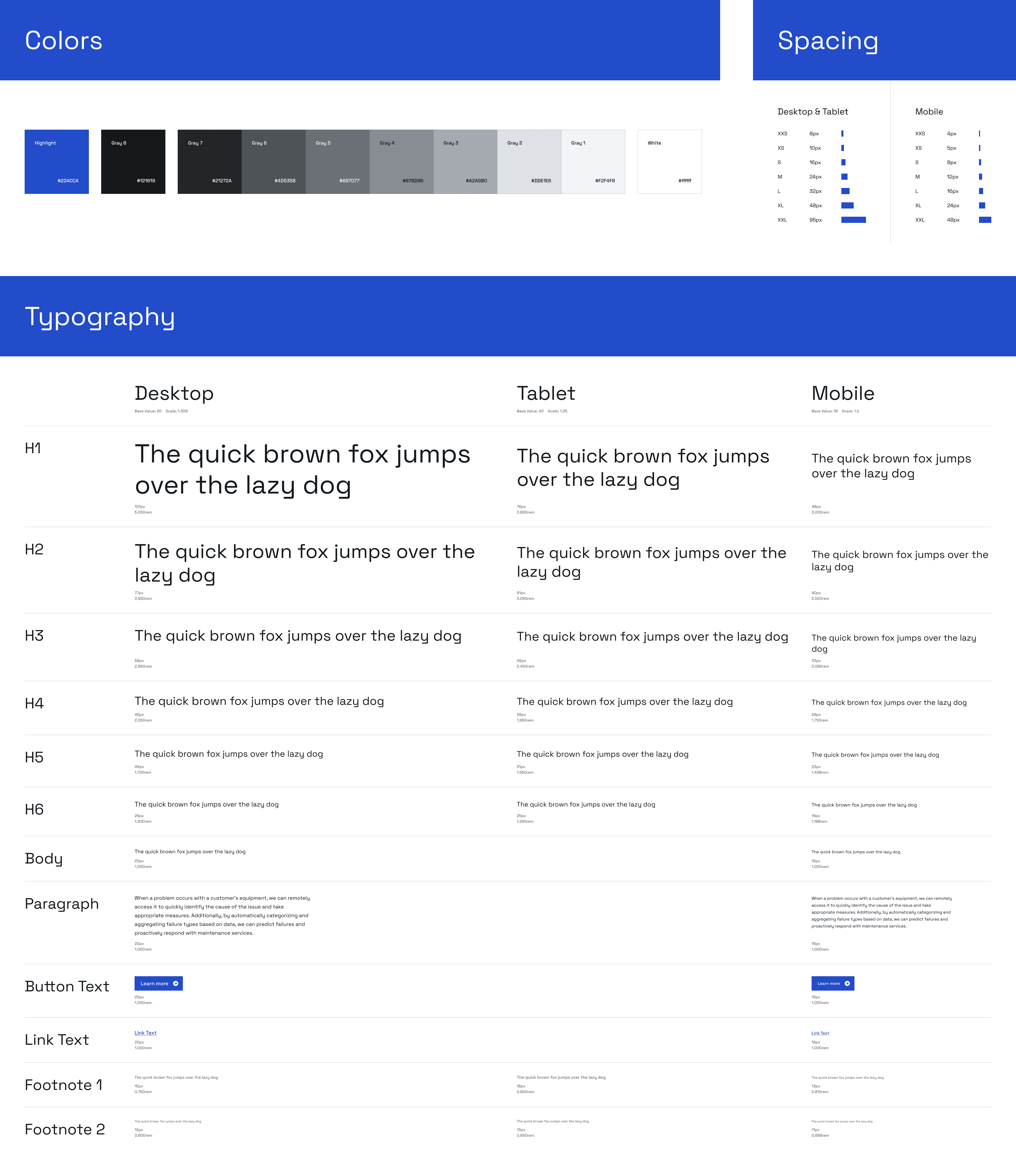
Before developing our UI guidelines, we first defined a design principle to set a clear direction for consistency and usability.
01
High-Tech Minimalism
We applied a futuristic and simple design to reflect the image of a high-tech company. By using minimalistic elements, we create an innovative atmosphere and prioritize functionality.
02
Refined Color Palette and Icons
To emphasize a sophisticated image, we use a restrained color scheme and enhance information delivery through icons. Icons are selected to fit their function and purpose, and they are used consistently to ensure harmonious design.
03
Readability-Focused Typography
We ensure high readability by considering font, size, and line spacing. A clean and uncluttered layout helps users understand the content, focusing on delivering the core messages of the website.
Style Guide
UI Consistency Guidelines
To ensure a cohesive and seamless user interface, we created this guideline so that all designers can follow the same patterns. This approach enhances collaboration, maintains visual and functional consistency, and simplifies the transition when delivering designs to Webflow.
Output
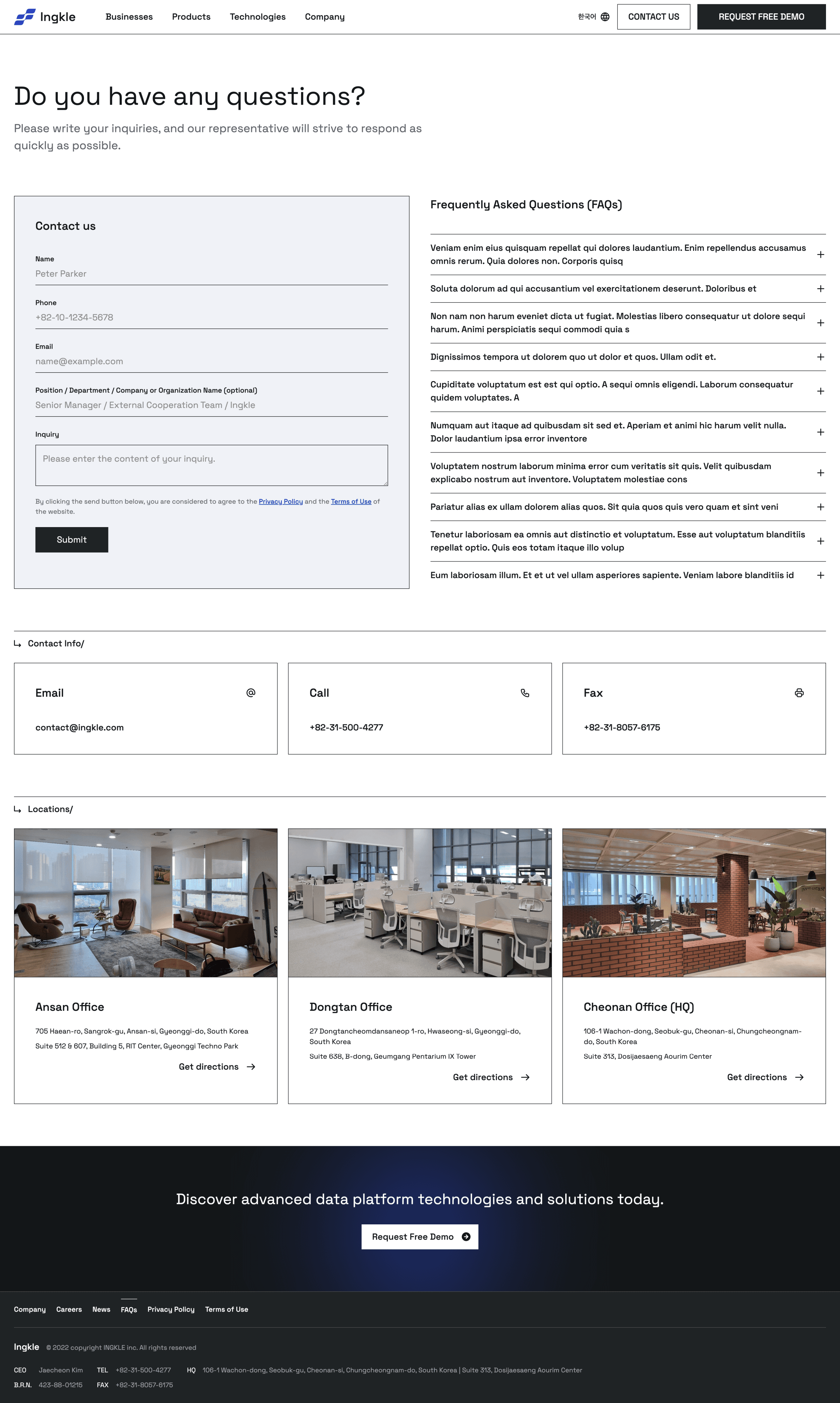
Contact Us
Careers
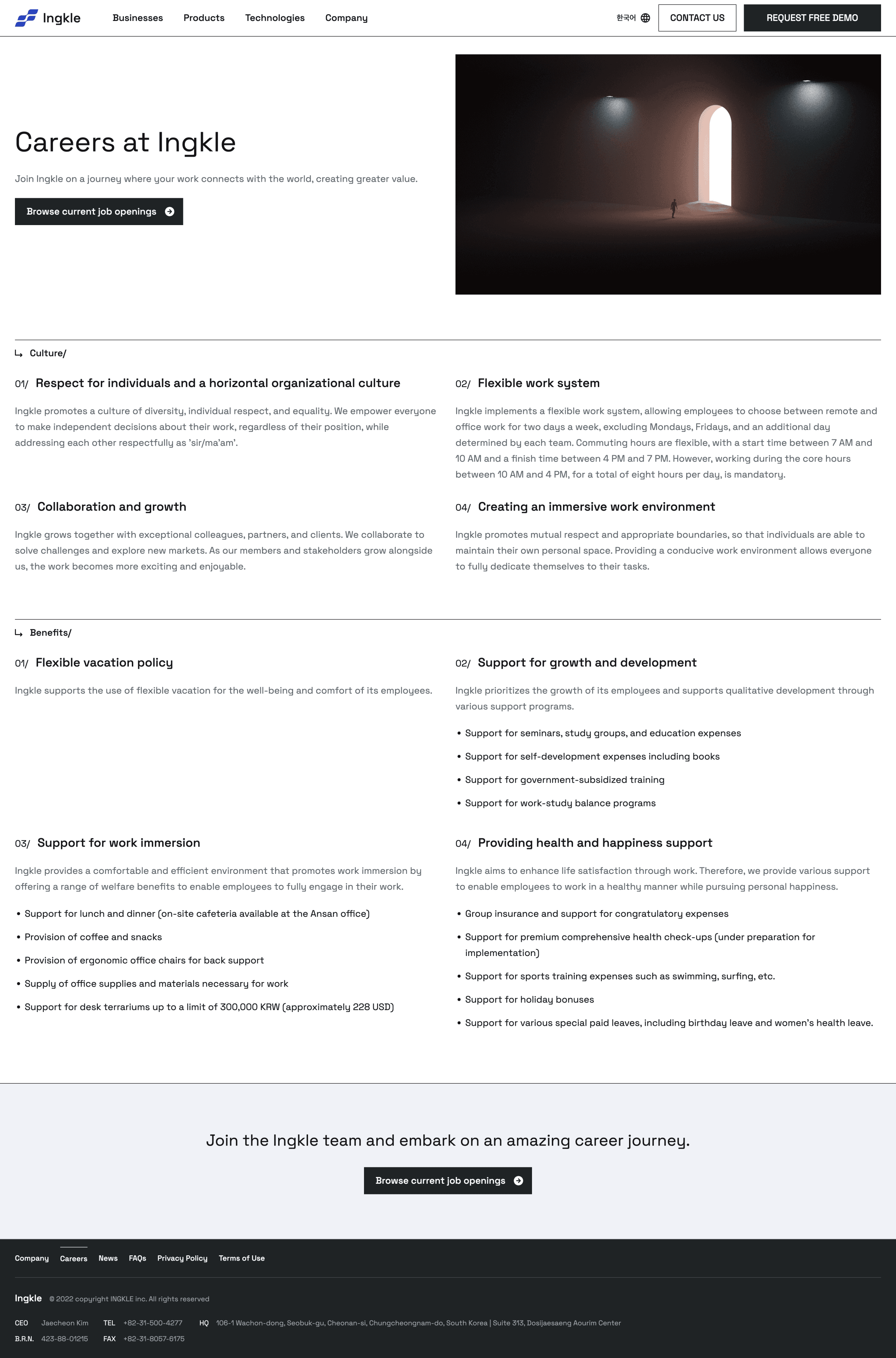
News
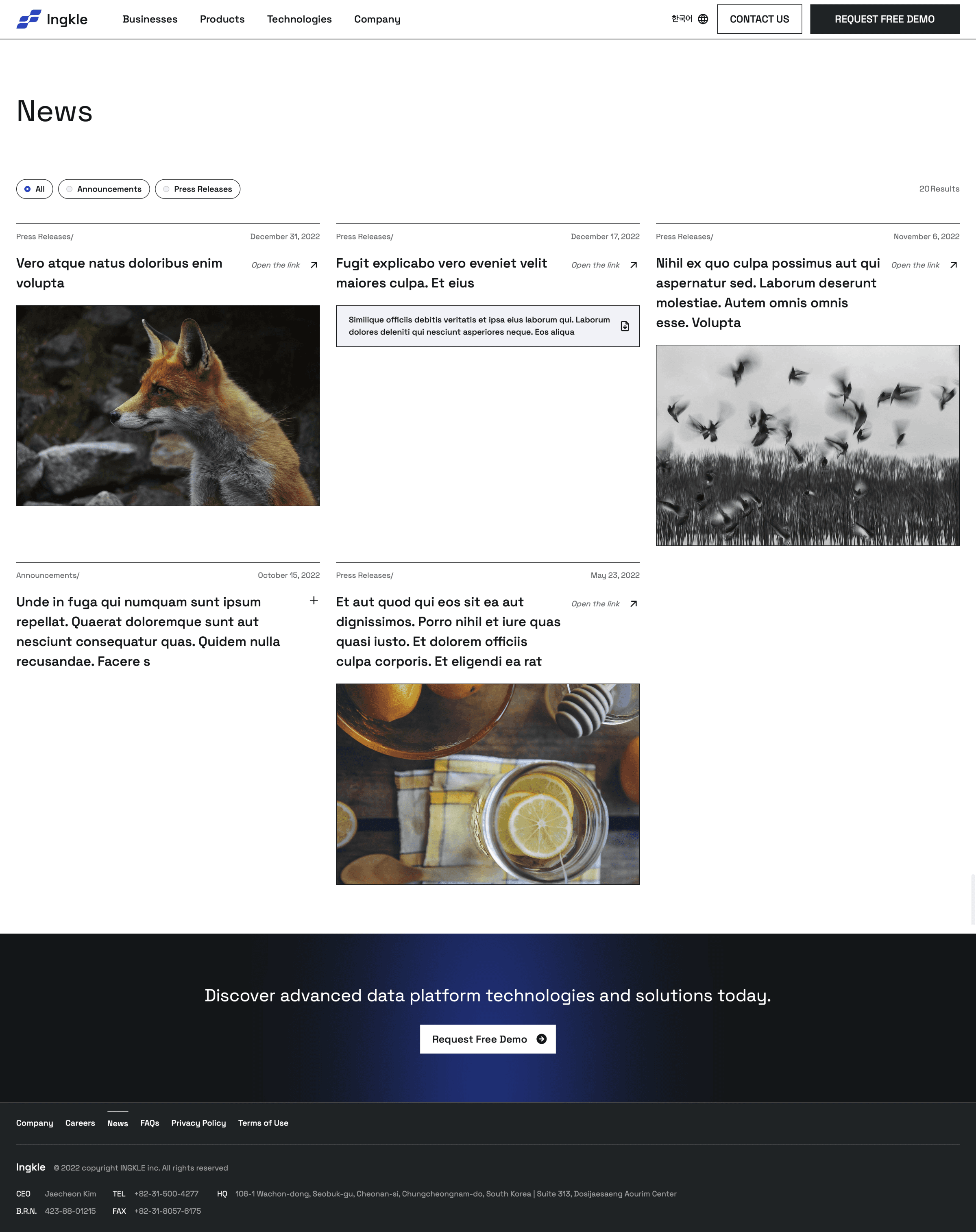
Request Free Demo
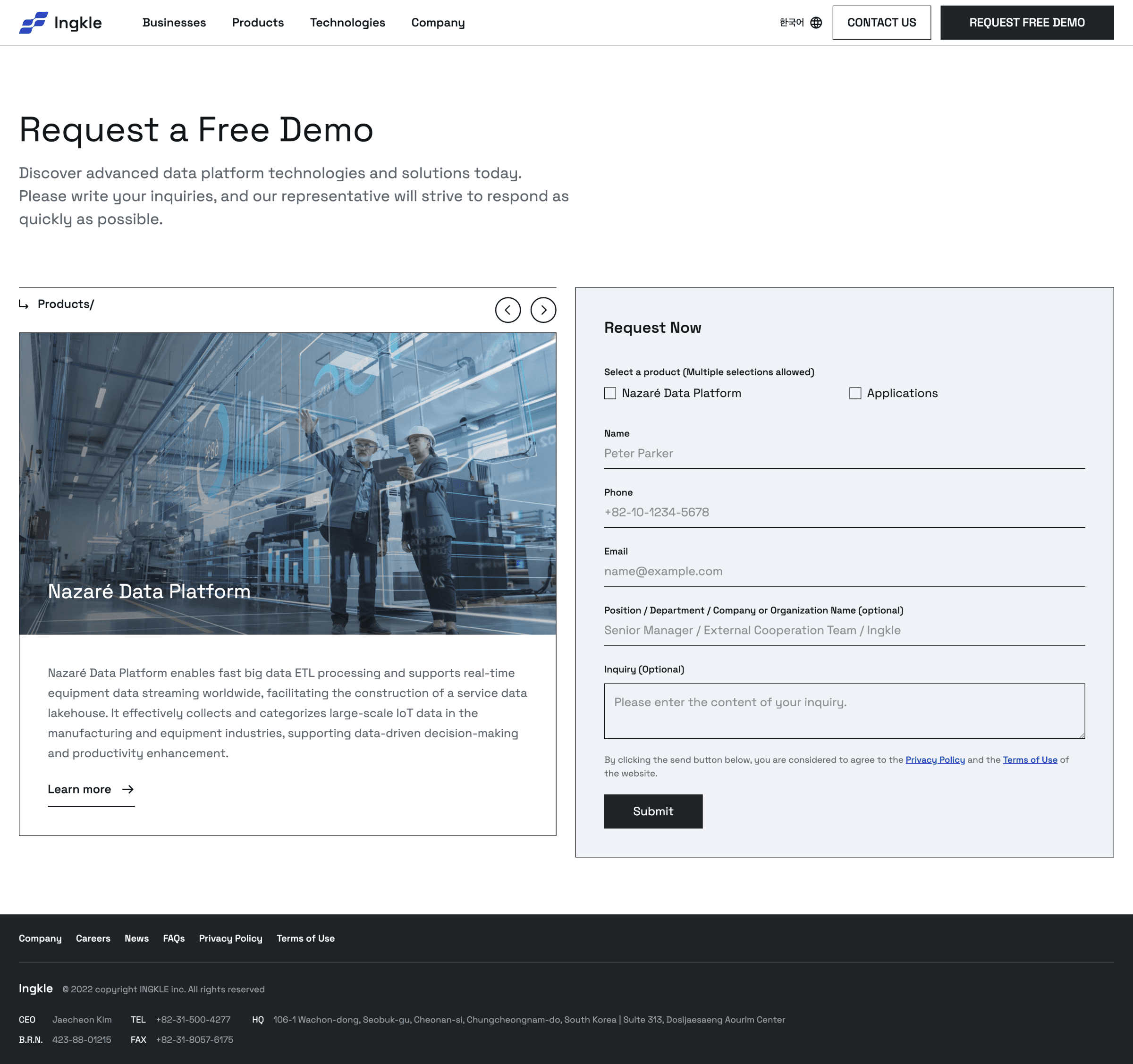
About Us

What I Learned
Reflecting on the project outcomes
This project was my first experience designing an app for clients. Since we were creating a completely new app, it was crucial to align with the clients' ideas. I learned how to communicate effectively with clients.
01
Communication with Clients
The clients only had brief ideas of what they wanted to create, so we spent a lot of time building the information architecture and developing mid-fidelity wireframes to visualize the app. This was my first time building an app from a solution, requiring me to communicate extensively with the clients to understand the background and align with their thoughts and ideas.
02
Organizing Files for Developer Handoff
Since there was no developer on our team, we needed to organize all the design files for a smooth handoff to the developers. This was my first experience seeing my design implemented in code. We created guidelines for padding and margins to ensure consistency across all designers' work.
